- Home - News
- TWI News | TV
- Polls
- Year In Review
- News Archive
- Crime & Punishment
- Politics
- Regional
- Editorial
- Health
- Ghanaians Abroad
- Tabloid
- Africa
- Religion
- Election 2020
- Coronavirus
- News Videos | TV
- Photo Archives
- News Headlines
- Press Release
Business News of Monday, 19 June 2017
Source: www.harmonyandcharm.com
How to pick a colour for your interior designs
 Craft your design so it pleases your body and mind
Designing one’s home can be a headache for many. An area which is usually neglected is the philological effect of interior design on an individual’s subconscious. Truth be told, the choices that we make when deciding on how our interior environment should look affects our emotions and perceptions.
It’s no surprise that colour is a main component of how we experience the world around us. But, what may be surprising to some is the fact that the colours in our environment have an effect on our moods and emotions. As you begin to imagine your home’s interior design, make sure that you are using colours in ways that fit with the tone you want to create in the space.
Modern color psychology dates its origins to the early 19th-century in the book ‘Theory of Colours’ by Johann Wolfgang von Goethe.
Though this concept has sparked debate regarding the implications of certain shades, researchers, interior designers and marketing professionals seem to agree on these basic concepts:
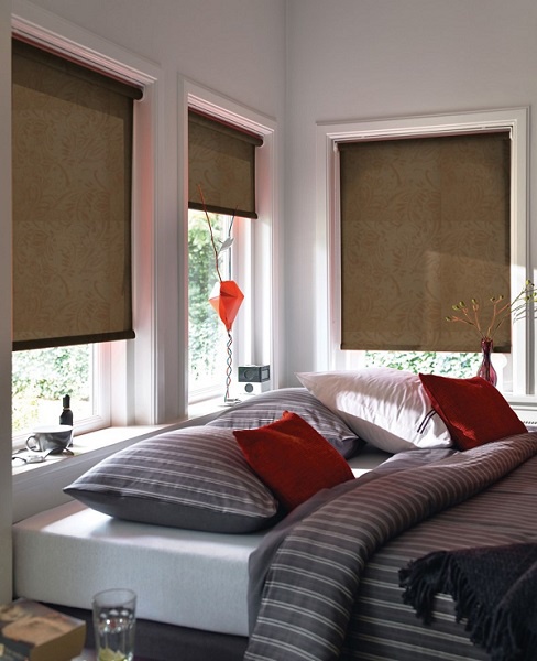
• Red: Symbolizes power and passion. It can be used to warm up spaces and make them feel more intimate.
• Orange: Offers a jolt of energy and innovation. It’s best used as an accent because too much can leave people feeling overwhelmed.
• Yellow: Associated with happiness, creation, and creativity. It works well in combination with a calming neutral and in rooms with lots of natural light to create a peaceful environment.
• Green: Known for its soothing qualities. Green is the perfect choice for a foyer or entryway because it eases the transition from the outdoors.
• Blue: Perpetuates feelings of calm and freshness. It’s a good fit for high traffic areas like kitchens and bathrooms.
• Purple: Connotes royalty and luxury. Purple is a great choice for formal living rooms or master bedrooms because it adds an air of lush sophistication.
• Gray: Gives a sense of relaxation and serenity. Use gray in spaces like home offices or bathrooms.
• Brown: Like green, brown’s natural appearance give it a relaxing touch. Choose it for rooms where the family gathers and furniture groupings that will incite conversation.
• Black: An assertion of power. Use black for statement pieces that you want to draw the eye.
• White: Relates a sense of cleanliness and purity. It is great for defining a space, but use white in conjunction with other colors since too much reads as sterile.

Don’t forget that, when you choose which colors to include in your interior, three picks are better than one. Choose a neutral for the largest items like walls and flooring, a calmer color for furniture and other sturdy items.
Then, pick a third more dramatic color to pop in your statement.


Entertainment


